Coffee
The Real Reason Why Starbucks Baristas Wear Green Aprons
Of the many things that Starbucks is iconized with, its baristas are one. Be it for the way they (mis)spell our name, their rebellion against drinks that are difficult to make, or their signature bottle green aprons. But have you wondered why green? Why not white, or red, or magenta or brown? Well, your questions have been answered because the coffee giant has revealed why the baristas wear a green apron.
And the answer is not because their logo is green, because there is a reason behind that as well. Just like there is a reason behind why Starbucks wasn’t name this.
Well, as it turns out the aprons weren’t always green. Initially, the baristas sported a brown apron back in 1971, much like the original Starbucks logo at their first location in Pike Place Market in Seattle. This is what it (the logo) looked like.
In fact, to start with, Starbucks had very little of what can be termed as a “uniform” in today’s date. “When I started, we had just four stores and were wearing cutoffs and flip-flops,” said William Stiles, a part-time clerk in Starbucks Capitol Hill store in 1982.
However, in 1987, Starbucks decided to move towards a more European-style coffee shop ambience complete with handcrafted drinks, black bow ties, jazz music, and the symbolic green apron, all of which metamorphosed into a more relaxed bow tie less setting – the kind of setting we recognize today as the typical coffee shop. This was the year 1992, and the aprons were stepped up with the addition of a deep green Medusa logo on its front.
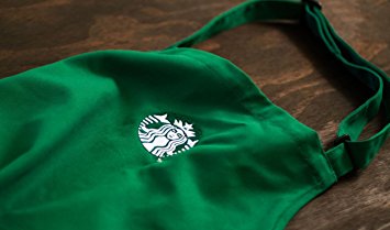 Image: Amazon.com
The company also let go of the darker aprons in a move to designate “partners certified in coffee knowledge,” a.k.a. coffee masters. In fact, ach apron colour symbolizes a particular purpose. The different colored aprons that we’ve seen throughout the years (e.g. orange, pale blue, purple, red, embroidered, etc.) stand for “celebrate events and milestones and recognize partner contributions.”
While a number of colours have been dropped from Starbucks’ apron palette, the forest-green has stuck like glue till date, quite evidently. And though there have been a number of guesses behind that particular hue, the actual reason remains unconfirmed by Starbucks. But our bet is on the fact that the shade was the brightest and most pleasing of the lot!
Image: dontmesswithtaxes.com
Feature Image: The Odyssey Online


Tuk Tuk – The Night Noodle Market at The Fatty Bao
Tuk Tuk The Night Noodle Market at The Fatty Bao Bengaluru, Karnataka – 2nd April, 2024 – Mark your...
Which mangoes are coming in this season? Attributed to – Team Madras Mandi
Which mangoes are coming in this season? Attributed to – Team Madras Mandi India accounts for a staggering 50% of...
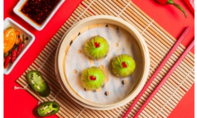

Spicing it up! : Foo’s Fiery Edit Menu Is Back
Spicing it up! : Foo’s Fiery Edit Menu Is Back Get ready to turn up the heat with Foo’s much-awaited...
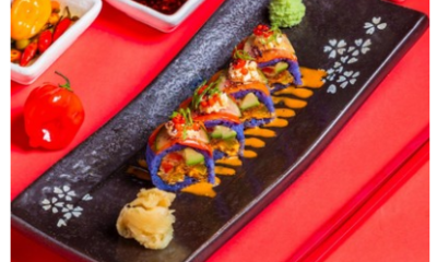

Experience the Fiery Edit Special Extravaganza at Foo
Experience the Fiery Edit Special Extravaganza at Foo Get ready for a Spicy feast like no other! Commence on a...

From Field to Feast: Maverick & Farmer Celebrates the Harvest Festival with an Immersive Weekend
From Field to Feast: Maverick & Farmer Celebrates the Harvest Festival with an Immersive Weekend A curated experience, workshops, exciting...